I've been playing around with my graphics editor and figured out a few tricks to make the pictures look better. I'll be putting these tricks to good use in future posts. However this may also mean longer periods in between posts since some of the touch ups require a fair bit of time to complete.
What follows are 3 untouched pictures with their corresponding edited pictures. Explanations on what was touched up are also included.

Unedited A: A bowl of stawberries.

Edited A.
A common trend in food blogs is to zoom in really close to the food item. In my humble opinion Unedited A was already a pretty enticing picture but a simple crop made the stawberries even more appealing.
Note: If you took a perfectly framed picture in the first place there's no need to crop it. However I prefer to take a picture that captures the whole subject and then crop it using the graphics editor. That way you can play around with the cropping until you are satisfied. Sure beats taking many pictures.

Unedited B: Pizza from Italiannies.

Edited B.
Yet again cropping the picture works its wonders but look carefully. There are two subtle additional techniques applied in Edited B that was not present in Edited A.
Cropping helped me get rid of the unsightly fingers you see in Unedited B. Now take a look at Edited B on the top right corner. You can make out a bottle containing some chilli flakes. Notice that it has been blurred. Another useful technique to bring attention to the subject in the picture is to blur the background. I think the same effect can be achieved using a DSLR camera but I don't own one so I have to depend on software to do it.
The other subtle technique used to make the picture more interesting was to position the subject off center. It's that simple.

Unedited C: Pam on the sofa.
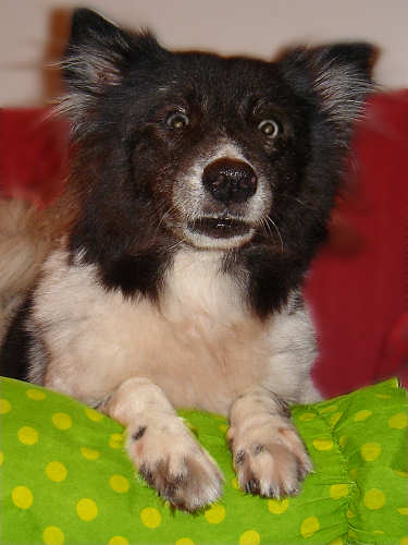
Edited C.
Actually Edited C can still be further cleaned up but it's sufficient to make my points. As usual I cropped out the unnecessary background. An interesting thing I did was to give the picture a portrait orientation instead of the common landscape orientation. Some pictures are suited to portrait orientations such as in this picture where the subject is vertically placed.
The blurring out the background technique introduced in Edited B was also applied here. There are some patches of fuzzy brown on the right side of the picture. That's actually Pam's fur. That should be cleaned up but I'm too lazy to do so because it's not important to the point :)
A bit more work was put into this picture than the first two. Pam's eyes didn't turn out very nicely in the picture. Her right eye is blind while she reflected the flash in her left eye. I had to redraw the eyes from scratch. I don't expect most pictures to require this much attention.
The last thing I did with the picture was to adjust the colours. I made the green pillow richer and the red sofa a darker shade of red. I think this gives the picture some better contrast. I doubt most pictures will need their color tweaked but I'll do it for some experimentation once in a while.
Note: All pictures are sharpened using a graphics editor application (I use Paint Shop Pro).


a golden opinion from Lengx2
I think this post is very interesting in itself! Food pics and photo tips :)
a golden opinion from wyejon
lengx2: thanks... hope u are able to put them to good use too.
a golden opinion from Tummythoz
Haha, ur Pam looked shocked! BTW, thx for d tips.
a golden opinion from wyejon
tummythoz: hahaha... i like the way the eyes came out. Hope you can make good use of the tips as well.